By Marina Gardasevic
@MarinaGNeuro
I’m sitting in a theatre, my coat squashed under me, staring up at powerpoint slides. I’m standing in a hot, humid conference room, paper plate in hand, staring at a poster. The person presenting this data is clearly very smart; their work sure looks complicated. They’re talking about Figure 4 now, should I tell them I was lost back on Figure 1? No I’ll just nod and smile, maybe eat a mini sandwich so I’m not expected to ask any questions.
Sound familiar?
Presenting data to someone other than yourself or your supervisor is hard. Made even harder if the audience isn’t in your field. So how do you help yourself present your data in a meaningful way? So that you aren’t met with slow nods and instead have meaningful productive conversations?
The answer is simple: have good figures that speak for themselves. What makes a ‘good’ figure? Edward Tufte defined this in 1983 as ‘clear, precise and efficient’ (1). A figure supports your message, so ask yourself: what is my message? and convey this so clearly in your figure that it is impossible to miss.
My goal is to provide insight to make your figures more suitable for your next presentation and therefore improve your skills as a research communicator both to those in your field and fellow mini-sandwich-eaters.
Paper Figure ≠ Presentation Figure
You have spent hours (if not weeks) optimising your figures for papers or reports. But simply inserting that figure into powerpoint won’t cut (or paste!) it. Figures have different purposes in papers and presentations; in papers your graphs aim to accurately present your data in a way that can be interpreted by other researchers (usually in your field) whereas the purpose of a figure in a presentation or poster is to convey your message (usually your main finding) and often to people from a variety of backgrounds. This is also reflected in the time people spend looking at figures in each scenario; unless you are going to stand in your presentation in silence for 5 minutes whilst your audience analyse your graph you are just not going to replicate it.
Therefore we are working towards the goal of our presentation figure: conveying a message. Clearly, precisely, efficiently.
Step 1 – Simplify your Axes
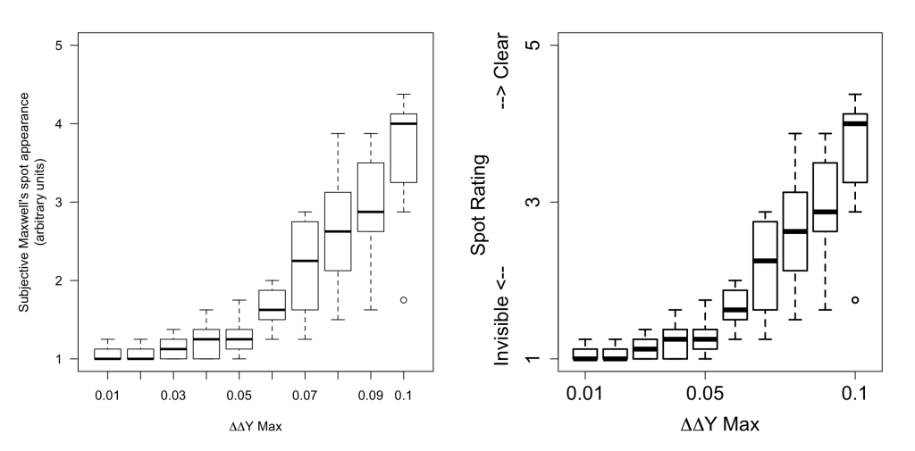
Axes don’t get the love they deserve; they are the part of graph people look at first and yet they are often the biggest contributor to figure confusion. In a presentation it is rarely important for axes to be fully marked. See the Figure below, on the left in the version we used in a paper (2), on the right is the version used in my poster on the same data. The take-home message I wanted to get across was “more rigid ΔΔY constraints reduced visibility of the spot phenomenon”. Even if you have no idea what that means this figure conveys that, and importantly, very little else. Text gets in the way so remove as much of it as you can. In line with this reducing accuracy of your axis values can help make your figure less cluttered. Does it help define my message? No? Remove it.
Step 2 – Make it bigger
It seems simple enough that paper figures and presentation figures are viewed at different distances, and therefore the latter should have everything relatively larger. By that I do mean everything. Line thickness, point size, axes thickness, axes marks, axes font, label font, legend… Make everything bolder, thicker, larger and your message will be far more easily digested. Compare the two figures below, at first glance: which is more appealing and clearer to you?

Step 3 – Remove Clutter
In line with reducing axes complexity there is a lot of clutter in figures that can be removed to make them more presentation-friendly. This is usually background colours, grids, additional annotations and figure inserts. Try to strip your figure down to its bare bones without detracting from your message. See below, with two graphs of the same data (left: cluttered, right: clear, big, simple). An important point here is to remove anything you won’t be referring to. There is nothing more annoying to hear as an audience member than “ignore the blue points” or “just look at these groups”. If it isn’t making it into your talk then it shouldn’t be in your presentation.
Step 4 – Talking through your figures
You’ve spent all that time making the most beautiful clear (efficient and precise!) figure so now you must do it justice. It is important that you walk your audience through your figure in an intuitive way, even if the majority of the audience is from the field.
- Don’t bring up the figure until you are talking about it; your audience will stop listening to you as they’ll be lost trying to interpret your figure
- Always always always always talk through the axes first
- Next the legend/defining the groups
- Finally the trend & take home message
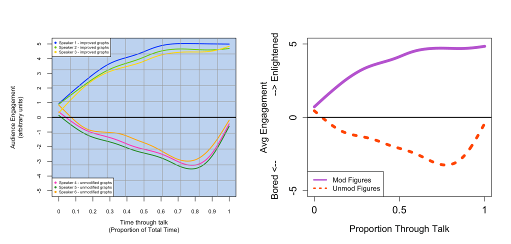
So for the figure above right I would say:
“Here we have average audience engagement from bored to enlightenment through the duration of a scientific talk for two groups: those with presentation-friendly figures in the solid purple line and those with unmodified figures in the dotted orange. As you can see unfriendly figures quickly lead to boredom, with the characteristic ‘it’s almost over’ dip at the end, whereas for those presentations with modified figures engagement steadily increases until enlightenment which persists to the end of the talk. In conclusion, making presentation-friendly figures improves ones presentation.”
Additional Tips
For those eager to go further here are my remaining tips, for the sake of clarity, precision and efficiency these are best as bullet points:
- Use colour wisely, 4.3% of the population (up to 12% of men) have a colour vision deficiency so check your figures are equally easy to discern if converted to grayscale (e.g. using https://www.color-blindness.com/coblis-color-blindness-simulator/), another option is to use different line styles (as the above figure) or points to distinguish groups.
- If using colour, be consistent across figures (if red is your control, then red should always be your control and nothing else should be red)
- To lead your audience through a complex figure, of if you want to deliver your result with a real punch then you can bring up each point in Step 4 as you are talking about it (e.g. bring up just the axes then have the first line appear when you talk about the first group and so on)
- File formats: make sure you export your files in high enough resolution so that when resized for your presentation they are clear. As a safe bet use a vector based format such as SVG, PGF and EPS, if using PNG aim for a resolution of 200 ppi (pixels per inch) which is similar to paper requirements
- For pleasing visuals keep the text and graph styles consistent throughout your presentation
References
All figures were created in R www.r-project.org
(1) – Tufte, E R. (1983) The Visual Display of Quantitative Information; Graphics Press: Cheshire, CT, pp 51
(2) – Gardasevic, M., Lucas, R. J. and Allen, A. E. (2019) ‘Appearance of Maxwell’s spot in images rendered using a cyan primary’, Vision Research. Elsevier, 165(October), pp. 72–79. doi: 10.1016/j.visres.2019.10.004. [data and figures]
Many thanks to Joshua Parkin & Manuel Spitschan for their helpful comments
Discover more from Research Hive
Subscribe to get the latest posts sent to your email.

One thought on “Figuring out your Presentation Figures”